Modern digital design is no longer limited to a single screen size, resolution, or device type. Users now interact with websites and applications across smartphones, tablets, laptops, ultra-wide monitors, foldable devices, and even wearable screens. This diversity has exposed a major weakness in traditional design systems: fixed pixel-based layouts.
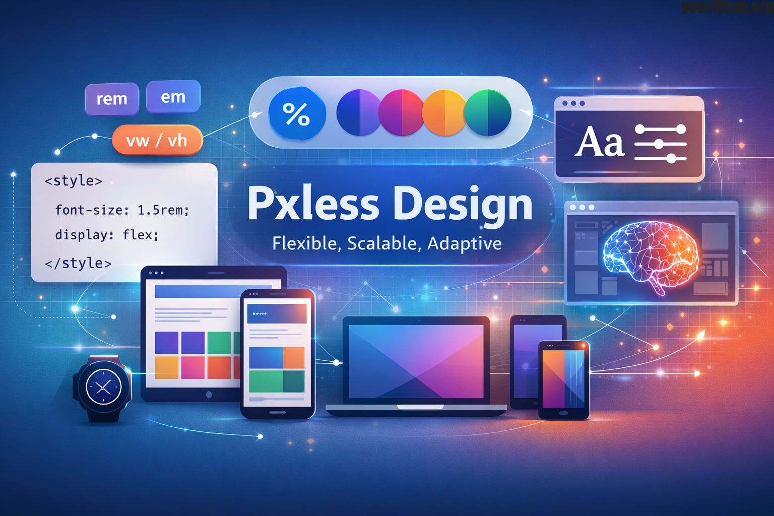
Pxless design emerges as a modern solution to this challenge. It is a design philosophy that reduces dependency on rigid pixel (px) values and instead promotes flexible, scalable, and responsive systems. Rather than designing for a fixed screen, Pxless design focuses on creating interfaces that adapt naturally to any environment.In simple terms, Pxless means designing with proportions instead of fixed measurements. It ensures that every element text, spacing, layout, and media responds fluidly to the user’s device and preferences.This approach is not just a trend it is a necessary evolution of digital design.
Why Traditional Pixel Based Design Is No Longer Enough
For many years, pixel-perfect design was considered the industry standard. Designers carefully defined every element in exact pixel values to ensure consistency. While this worked in early web environments with limited screen variation, it has become increasingly outdated.
Today, users access content in unpredictable ways. Users may view a website on a 6-inch mobile phone, a 13-inch laptop, or a 34-inch ultrawide monitor all within the same day.Fixed pixel layouts struggle in this environment.
Key Problems with Pixel Based Design
- Lack of Flexibility Fixed pixel values do not adapt to different screen sizes, causing layouts to break on various devices.
- Poor Accessibility Support Pixel-based designs often fail when users increase font size or zoom, leading to overlapping or broken content.
- High Maintenance Complexity Managing multiple breakpoints and device-specific styles increases development effort and CSS complexity.
- Inconsistent User Experience The same pixel values appear differently across devices, resulting in uneven spacing, alignment, and readability issues.
What Exactly Is Pxless Design
Pxless design is a modern UI development philosophy that moves away from fixed pixel measurements and instead embraces relative and scalable units to create flexible, responsive interfaces. Rather than defining every element with exact pixel values, Pxless focuses on relationships between elements, meaning layouts rely on proportion rather than strict precision.
The core idea of Pxless is that design should adapt to the environment instead of forcing the environment to adapt to the design. It does not completely remove the use of pixels, but it significantly reduces their importance in layout structure and encourages the use of scalable systems that naturally adjust across different screen sizes, devices, and user preferences.
Core Principles of Pxless Design
Several foundational principles that guide how interfaces are created form the basis of Pxless design.
Common Relative Units
Pxless design uses relative units like rem, em, %, and vw/vh instead of fixed pixels. These units help layouts scale automatically based on screen size or user settings, improving responsiveness and readability across all devices.They also reduce the need for multiple device-specific adjustments, making design systems more efficient and maintainable.
Fluid Layout Systems
Pxless design relies on flexible systems such as CSS Flexbox and Grid to create dynamic layouts. These systems allow elements to resize, reposition, and maintain proper spacing without needing fixed widths or rigid structures.As a result, interfaces feel more natural and adaptive across different screen sizes and resolutions.
Content First Design Approach
Instead of designing for specific devices, Pxless design starts with content. Content hierarchy shapes the layout by ensuring that breakpoints and structure adjust naturally based on how content flows and fits. This approach creates more readable and user-friendly interfaces across all platforms.
Scalable Typography
Typography in Pxless design is built to scale smoothly across different devices. Using flexible units and functions like clamp(), text remains readable on all screen sizes while still respecting user preferences and accessibility needs.It also ensures visual balance between headings, body text, and UI elements.
Design Systems and Tokens
Pxless design uses structured design systems with tokens to maintain consistency. These tokens define spacing, typography, colors, and component sizes, making it easier to scale and manage large applications efficiently.They also help teams maintain uniform design rules across multiple pages and products.
How Pxless Improves User Experience
User experience is at the core of Pxless design because it ensures that interfaces remain readable, usable, and visually balanced across all devices. Better readability results when text automatically adjusts based on screen size and user preferences, making content easier to consume in any environment.
Seamless responsiveness allows layouts to adapt smoothly without breaking or requiring multiple versions for different devices. It also reduces user friction by eliminating the need for zooming, horizontal scrolling, or manual adjustments to view content properly. Overall, Pxless design delivers consistency across devices, ensuring that interfaces feel stable, predictable, and comfortable regardless of screen size or resolution.
Pxless and Accessibility
Accessibility is one of the strongest benefits of Pxless design because it is built to adapt to different user needs and preferences. Many users rely on screen zoom, larger font settings, or assistive technologies to interact comfortably with digital content. In traditional pixel-based layouts, these adjustments often cause issues such as overlapping elements, broken layouts, or unreadable text. Pxless design solves these problems by using scalable and flexible units that respond smoothly to user settings.
This ensures that content remains properly structured, visually consistent, and easy to read. As a result, users experience no overlapping content, no broken layouts, and significantly better readability across all devices and accessibility conditions.
Pxless vs Traditional Pixel Design
| Feature | Pixel-Based Design | Pxless Design |
| Units | Fixed px values | Relative units |
| Responsiveness | Breakpoint-heavy | Fluid and adaptive |
| Accessibility | Limited | Strong support |
| Maintenance | Complex | Simplified |
| Future readiness | Low | High |
Real World Applications of Pxless Design
Pxless principles are already widely used in modern digital systems across different platforms and industries. In web applications, especially SaaS platforms and dashboards, flexible layouts are essential for handling large amounts of data while maintaining clarity and usability. Mobile applications also rely on scalable units within UI frameworks to ensure a consistent experience across various screen sizes and device types.
In e-commerce platforms, Pxless thinking helps product pages adapt smoothly to different screens without breaking layout structure or affecting usability. Similarly, modern design systems such as Material Design incorporate scalable spacing, typography, and component rules that closely align with Pxless principles, ensuring consistency, responsiveness, and better user experience across all digital environments.
Benefits of Adopting Pxless Design
- Improved Scalability Interfaces can easily grow and evolve without needing a complete redesign of existing layouts.
- Faster Development Reusable design systems reduce repetitive styling work and speed up the overall development process.
- Reduced CSS Complexity Fewer breakpoints and overrides are required, resulting in cleaner and more maintainable code.
- Future-Proof Interfaces Designs are better prepared to support new devices, screen sizes, and emerging technologies.
Challenges of Pxless Design
Although Pxless design offers many advantages, it also comes with a few challenges that teams must overcome during adoption. The first major challenge is the learning curve, as designers and developers need to move away from traditional fixed-pixel thinking and adopt a more flexible, proportional mindset. This shift can feel unfamiliar at first, especially for those who are used to pixel-perfect layouts. Another challenge is system planning, since Pxless design works best when there is a well-structured design system in place. Without proper planning of spacing scales, typography rules, and layout behaviour, the system can become inconsistent or difficult to manage.
Despite these challenges, properly adopting Pxless principles creates stronger, more maintainable, and future-ready design systems that significantly improve long-term workflow and product quality.
How to Implement Pxless Design
- Replace Fixed Pixels with Relative Units Start by converting fixed pixel values into scalable units like rem or em. This helps elements adjust automatically with user settings.
- Use Flexible Layout Systems Implement CSS Flexbox and Grid to create adaptive structures that respond naturally to different screen sizes.
- Create Design Tokens Define consistent scales for spacing, typography, and components to maintain uniformity across the entire interface.
- Test Across Devices Regularly check how layouts behave on different screen sizes to ensure smooth responsiveness and avoid breaking designs.
- Continuously Improve and Optimise Refine your scaling system based on real user behaviour and feedback to improve performance and usability over time.
Future of Pxless Design
The future of UI development is increasingly centred around adaptability rather than fixed structure, and Pxless design fits naturally into this direction. As digital ecosystems become more complex, emerging trends such as container-based responsiveness are changing how layouts behave, allowing components to adjust based on their surrounding space instead of the overall screen size.
At the same time, variable fonts are making typography more flexible, enabling smooth transitions in weight, width, and style without needing multiple font files. Another major advancement is the rise of AI-generated layouts, where systems can dynamically create and adjust interfaces based on user behaviour and content needs.
Conclusion
Pxless design represents a fundamental shift in how digital interfaces are created. Instead of relying on fixed pixel measurements, it focuses on flexible, scalable, and responsive systems that adapt to any environment.
This approach improves accessibility, enhances user experience, simplifies development, and prepares digital products for the future.In a world where devices are constantly evolving, Pxless is not just a design choice it is a modern necessity for building sustainable digital experiences.
Disclaimer
The information provided on this website is for general informational and educational purposes only. All content related to Pxless design and related topics explains concepts and industry practices and does not serve as promotional material, professional advice, or a guaranteed standard for implementation.While we strive to ensure accuracy and relevance, we make no representations or warranties of any kind regarding completeness, reliability, or suitability of the information. Any action you take based on this content is strictly at your own risk.